

“This place is under new management, by order of the Peaky Blinders.”
Peaky Blinders
2019 - Remastered in November 2021
24x36” Screen printed poster inspired by BBC’s Peaky Blinders.
Client: Private Commission.
Printers: VGKids + White Duck
Colour Separations: Saniose.
‘Peaky Blinders’ Remastered 2021 screen print regular - 16 colour screen print, printed on French Speckletone Madero Beach paper.
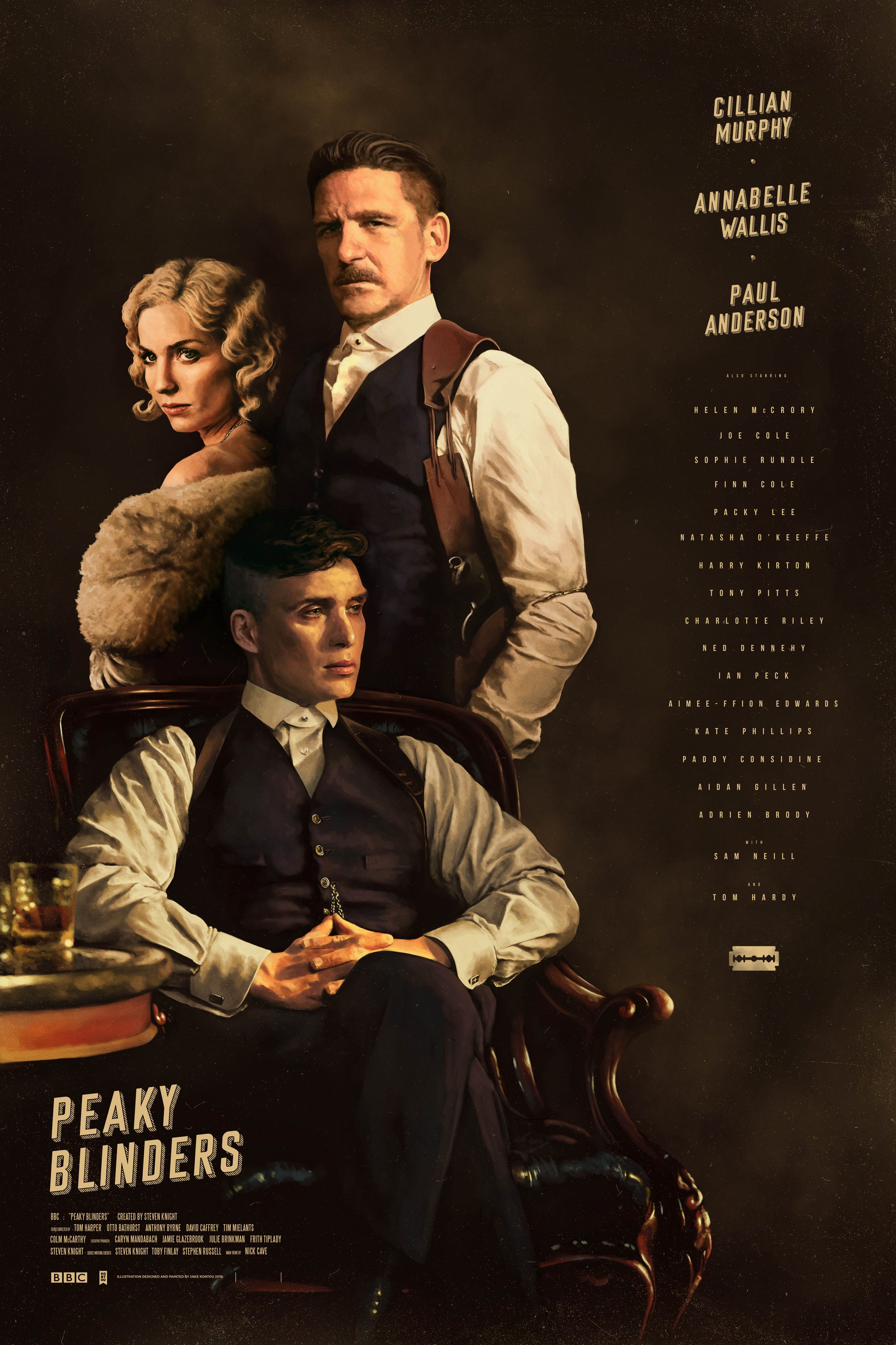
‘Peaky Blinders’ Remastered 2021 giclée variant - Printed on Platinum Etching paper with a screen print layer for typography and graphic design.
Synopsis: Birmingham, UK, 1919. In the aftermath of WW1, the Shelby family are making a name for themselves as bookmakers, racketeers and gangsters. Tommy (Cillian Murphy), the second oldest of the Shelby family will carve out an empire for himself that will stretch beyond Birmingham. This with the aid of his brothers Arthur (Paul Anderson), John (Joe Cole) and Aunt Polly (the late Helen McCrory) form the Peaky Blinders.


Creative Process.
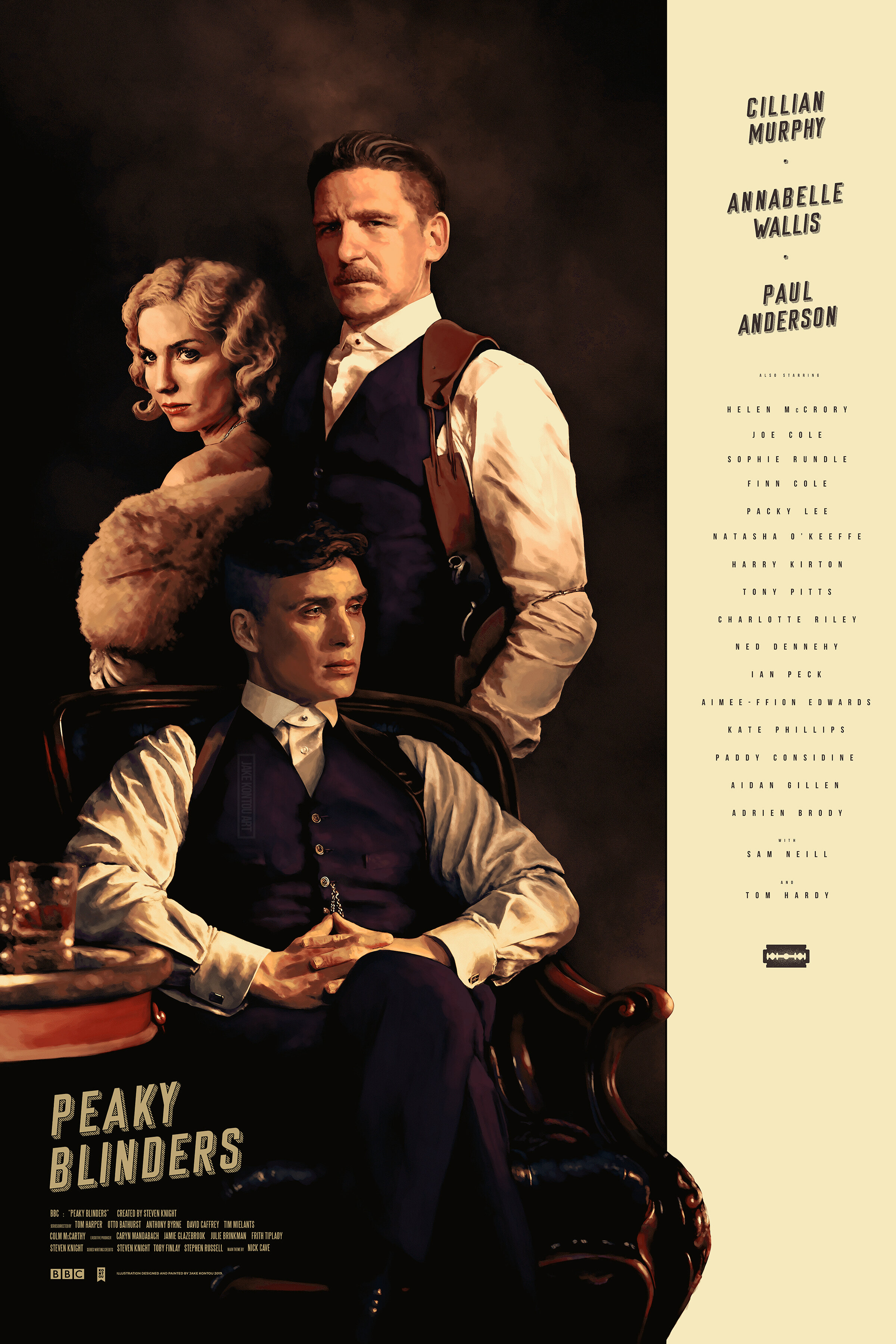
From the onset the piece was always envisioned to act as the Shelby family portrait found in the fictitious home of lead protagonist Tommy Shelby.
Regarding the concept, Tommy (Murphy) would take centre stage on his throne, plotting the future of the families actions, surrounded by those closest to him, brother Arthur (Anderson) and future wife Grace (Wallis). Developing a composition around this concept required taking a more minimalist approach as apposed to filling the design with a large number of characters.
Although still important, it was decided that key characters like younger brother John (Cole) and Aunt Polly (McCrory) would be amiss in this design as it favours a less is more approach.
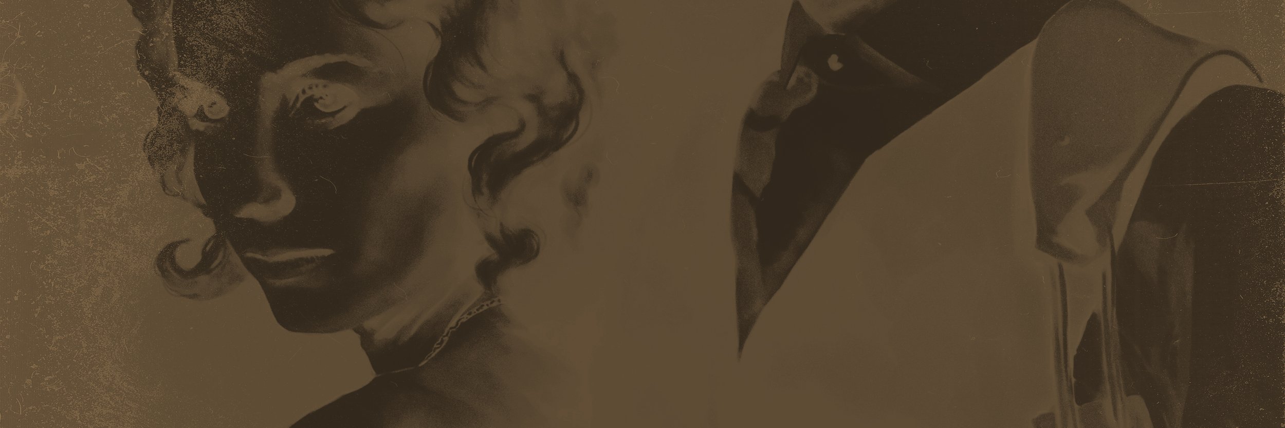
Similar to ‘Casino’, the aim was to achieve the ‘gangster’ aesthetic with a colour pallet of burgundies and purples contrasted with warm creams. Illustrating suits would also aid this goal, while a challenge to do correct, the immediate result achieves the appearance of class and prestige.
Created using Adobe Photoshop and Adobe Lightroom on a Wacom Cintiq.
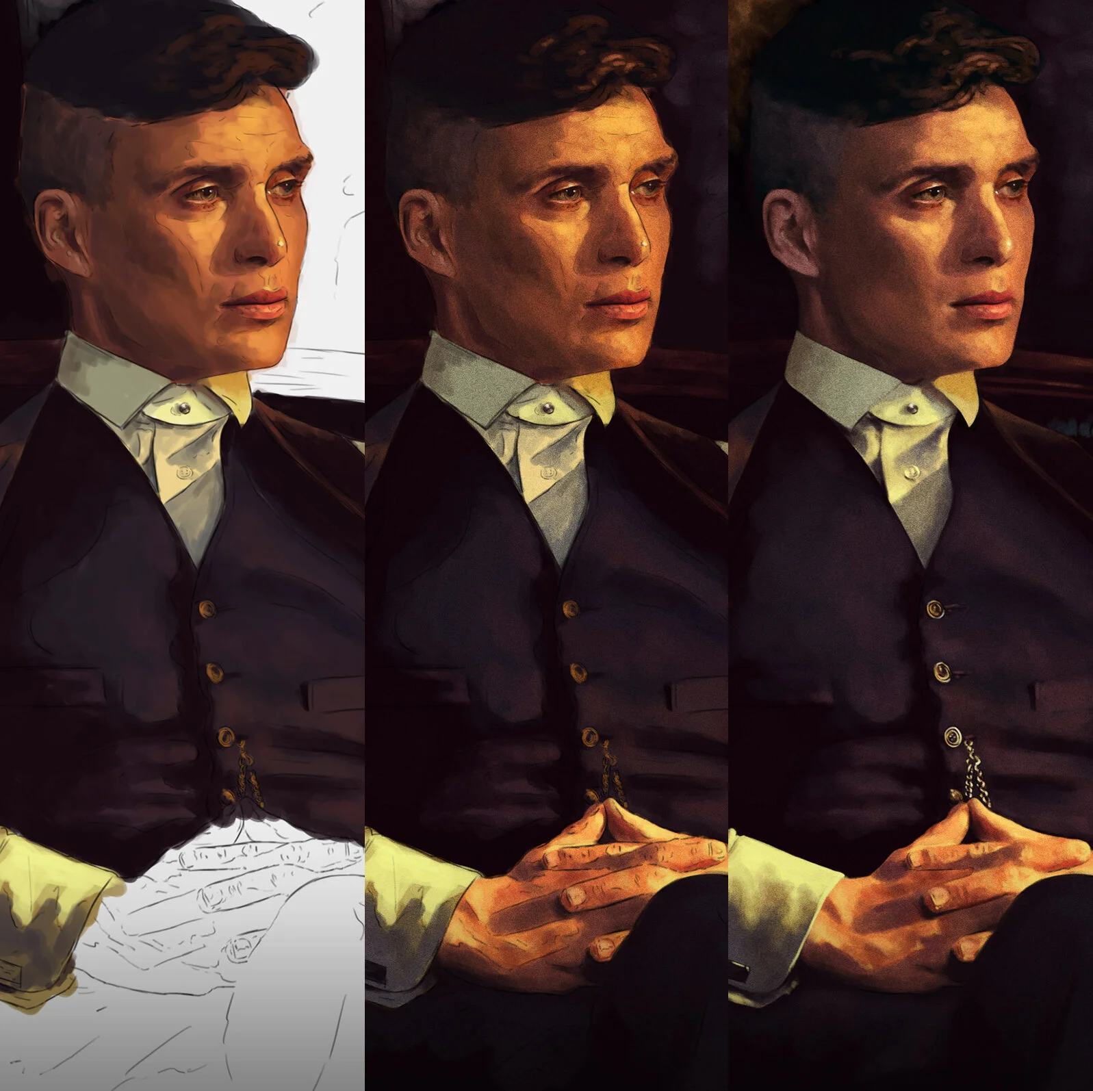

Sketch to Final.


A decision made early in development was to switch out John (Cole) for Grace (Wallis).
Similar to the show, the layout of the poster was to mainly revolve around Tommy (Murphy) and those who affect his character the most. Although vital, younger brother John was trumped by Grace based on her significance in the early seasons of the show and the lasting changes she made on Tommy’s arc.
Fonts, title and credits placement was also changing regularly throughout development. As this was a poster based around a TV show, the cast list was extensive, but it was important to have their entire inclusion on the piece. The bold cream strip contrasting the smoke filled dark backdrop was a great container for most of these text elements and forced primary attention onto the characters depicted.

Video Process created by @iTzSTU4RT
For Helen McCrory. Forever a scene stealer.